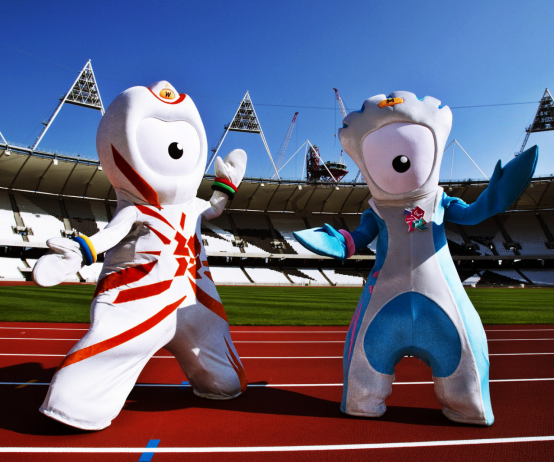
The mascots of the 2012 London Olympic Games and Paralympic Games, Wenlock and Mandeville, are undoubtedly among the most controversial and discussed mascots. Not only did they attract the public’s attention with their unique design style and futuristic appearance, but they also became an important presence in the history of design due to some controversy. What is the story behind this pair of mascots? And why did they cause such a strong response among the public? Let’s find out.
The creative background and design inspiration of Winnie and Mande
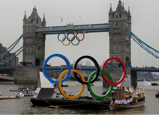
The two mascots, Winnie and Mandeville, did not come about by chance. They represent the 2012 London Olympic Games and the London Paralympic Games respectively. Their names come from two places closely associated with the Olympic spirit – Much Wenlock and Stoke Mandeville. Both places are one of the birthplaces of the modern Olympic Games. Much Wenlock once hosted the world’s first modern Olympic Games, while Stoke Mandeville Hospital is the birthplace of the Paralympic Games.
The mascots were designed by London creative agency Iris, and the overall design concept hopes to represent the vitality and innovation of the Olympic spirit through these interesting and futuristic characters. However, their designs sparked strong controversy after they were released.
Winnie: A modern mascot
Appearance and symbolism
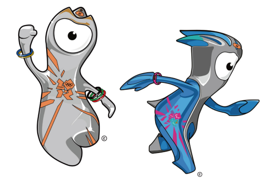
Winnie’s appearance is a character designed based on metal and industrial elements, with a simple and futuristic shape. Its head is designed to be shaped like a traffic light, and its eyes are like cameras, which can “record” everything it sees. Its body is made of smooth steel, reflecting the luster of the surrounding environment, symbolizing the innovation and vitality of the modern city of London. The most special thing is that there is a yellow signal light on Winnie’s forehead, which echoes the iconic yellow light of London taxis.
Winnie’s Personality
Winnie is a lively and curious mascot. Her personality is very friendly and exploratory, like a child exploring the world. She likes to interact with everyone in the world and record everything she sees. Winnie’s design not only represents the modernization of the Olympics, but also conveys the message of “connecting the world.”

Mander: A symbol of resilience at the Paralympics
Appearance and symbolism
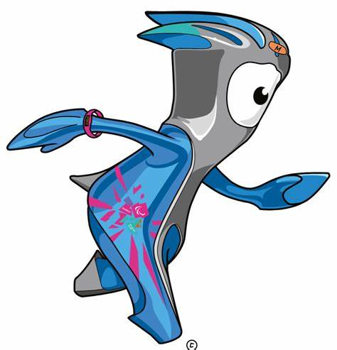
Mand’s design is inspired by similar things to Winnie, but its appearance is more sporty and powerful, especially its head, which is streamlined like a motorcycle helmet, highlighting its aerodynamic characteristics. This design is highly consistent with the spirit of the Paralympics – athletes rely on unremitting efforts and perseverance to break through themselves and constantly pursue excellence. Mand’s eyes also have a recording function. There are three nails on its helmet, representing the Paralympic logo Agitos, symbolizing the three different colors and the unity between athletes.
Mander’s personality
Mander’s personality is more about tenacity and challenge. He is a character who dares to try, even in the face of difficulties, and will try again and again until he succeeds. This determination and unyielding spirit is a true portrayal of Paralympic athletes. The time tracker he wears on his wrist is a symbol of his constant transcendence and challenge.
Mascot design controversy: Why is it so controversial?
Criticism: Too abstract and mechanical
Although Winnie and Mander’s designs are modern and futuristic, they are not recognized by everyone. Some critics believe that their designs are too abstract and lack warmth and affinity. Compared with past mascots, Winnie and Mander appear mechanical and cold, and it is difficult for ordinary audiences to resonate emotionally. Some critics even describe them as “the drunken product of Teletubbies and Dalek (the alien robot in “Doctor Who”)”, which makes many people puzzled and confused.
Comparison with the 1996 Olympic mascot “Izzy”
Some people compared them to the mascot “Izzy” of the 1996 Atlanta Olympics, which was also criticized for being too abstract. Winnie and Mand were also considered too “digital”, and some even mentioned that their huge eyes seemed to be a metaphor for London, the most heavily monitored city in the world, giving people a sense of unease.
Some people have seen their “surveillance aura”
Media critic James Bridle even pointed out that Winnie and Mander’s big eyes are reminiscent of London’s CCTV surveillance system. In London, where the ratio of cameras to residents is the highest, this design seems to have inadvertently created a certain connection with London’s surveillance culture, giving people an alternative feeling – these mascots seem full of vitality, but they also imply “surveillance”.
Positive review: Creating a modern and futuristic image
Of course, Winnie and Mander also have their supporters. Some design experts believe that this ultra-modern, futuristic design is exactly the symbol of London, representing the close connection between this historic city and technology, innovation and globalization. Creative Review commented: “They look very suitable for this digital age.” For young people, Winnie and Mander’s appearance is very attractive, they are creative, dynamic and futuristic.
Summary: The Legacy of Winnie and Mander
Whether it is the mixed reviews or their modern design as mascots, Winnie and Mander have successfully combined the spirit and technology of the 2012 London Olympic and Paralympic Games. They are not only representatives of London, but also symbolize the innovation and inclusiveness of the global Olympic movement. Although their appearance and design have caused a lot of controversy, it is undeniable that they have left a strong mark in Olympic history.
Today, Winnie and Mander, as the cultural heritage of the London Olympics, still occupy a place in the memory of many people. They also remind us that the design of mascots is not only the pursuit of beauty, but also a profound reflection of the spirit of the times, cultural atmosphere and social trends.
Editorial note: This is independent cultural and historical commentary. It is not official, authorized, sponsored, endorsed by, or affiliated with the International Olympic Committee, Olympic Games organizers, teams, venues, museums, athletes, or rights holders mentioned.

Related Posts