The Olympic logo is more than just a simple graphic. It carries the spirit, history, and global cultural integration of the Olympic movement. The logo design of each Olympic Games is a comprehensive reflection of art, history, and culture. They not only represent a specific era, but also convey a belief to the world: regardless of national boundaries or skin color, all athletes are working towards the same goal – unity and peace. Behind these logos, there are many emotional fluctuations and cultural implications that we usually ignore.
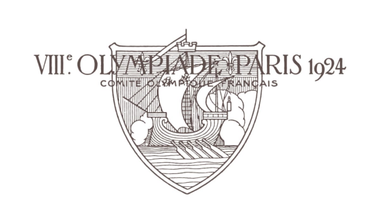
1. The 1924 Paris Olympic Games logo: simple and contemporary
When we look back at the logo of the 1924 Paris Olympics, we may think it is too simple, even a little “plain”. However, this simplicity reflects the spirit of that era – simple, practical and modern. At that time, the modernist trend swept the world, and all designs began to pursue a kind of “unadorned beauty”, and all of this was clearly reflected in the Olympic logo.
Design Analysis:
Clean lines: The logo uses very simple geometric shapes and fonts, reflecting the pursuit of “functionality” at the time.
Symbolic meaning: Its circular design represents equality and unity among athletes. It has almost no decorative elements, but it conveys a strong spiritual power. It is extremely simple, yet full of a sense of the future.
However, looking back, we may wonder why it is so simple, yet it has left such a deep impression in the long river of history? Doesn’t it remind us of the philosophy of “less is more” through its minimalist form?
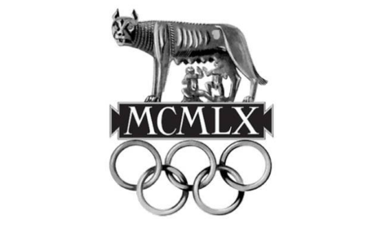
2. The 1960 Rome Olympic Games logo: a collision of boldness and art
The logo of the 1960 Rome Olympics gives people a completely different feeling. Compared with the simplicity of the Paris Olympics, the design of Rome is bolder, full of geometric aesthetics and artistic atmosphere. It seems that it is no longer just a logo, but a kind of work of art, reflecting the perfect combination of sports and aesthetics.
Design Analysis:
The aesthetics of geometric shapes: The logo uses abstract geometric shapes, which not only show the movements of athletes, but also strengthen the dynamics and power of the Olympics.
Combination of art and functionality: This design perfectly combines artistic expression with the functionality of the Olympics, bringing a richer visual impact.
However, we may ask, can such an artistic design convey the core spirit of the Olympics? Or, does it transcend tradition to some extent and make bold innovations? We cannot deny that the freedom, power and beauty it demonstrates do make every detail full of unparalleled charm.
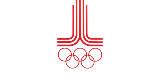
3. The 1980 Moscow Olympic Games logo: a deep interweaving of politics and culture
The logo of the 1980 Moscow Olympics is full of political meaning. It combines the national symbol of the Soviet Union with the five Olympic rings, symbolizing the Soviet Union’s strong national momentum and its expectations on the international stage at that time. It is a product of the interweaving of political and cultural symbols. The tower in the logo symbolizes the power of the Soviet Union, while the red and gold colors symbolize the Soviet Union’s glory and political stance.
Design Analysis:
Strong political color: The logo uses a lot of elements with political symbolism, reflecting the political background and social atmosphere at that time.
Integration of traditional architecture: The shape of the tower is in line with the traditional Soviet architectural style, symbolizing a powerful state apparatus.
However, does such a strong political color limit the universality of the Olympic spirit? We can’t help but ask: Does the logo of this Olympic Games, to some extent, limit the core Olympic concepts of “unity” and “peace” to a specific political perspective?
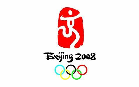
4. 2008 Beijing Olympic Games Logo: A Perfect Fusion of Tradition and Modernity
The logo of the 2008 Beijing Olympic Games is a model of the integration of modernization and traditional culture. The main part of the logo is “auspicious clouds”, which symbolizes auspiciousness, peace and prosperity, and the entire logo is designed with a strong sense of flow and curves, conveying the theme of dynamics and harmony. This logo not only shows the heritage of Chinese traditional culture, but also conveys the concept of “harmonious coexistence” to the world.
Design Analysis:
Cultural significance: The “auspicious clouds” element represents China’s traditional culture, while the flowing lines symbolize the dynamics of the Olympic Games.
Modern artistic expression: Although the pattern is traditional, it adopts modern design techniques, showing the confidence and innovation of Chinese culture.
At this point, we may wonder: why can a traditional symbol like “Lucky Clouds” express the core spirit of the Olympics so accurately through modern design techniques? Why can it transcend time and space and directly touch our hearts?
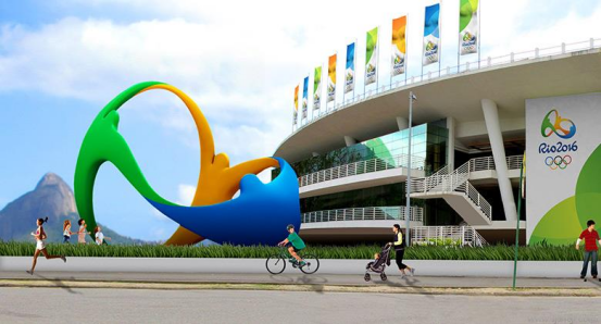
5. Rio 2016 Olympic Games Logo: Freedom and Diversity of Color
The logo of the 2016 Rio de Janeiro Olympic Games is full of Brazilian passion and vitality. It boldly uses bright colors, and the three characters in the logo are intertwined, symbolizing unity and cooperation. The logo not only shows the image of athletes, but also incorporates the rich natural and cultural characteristics of Brazil, showing the theme of “diversity and inclusion”.
Design Analysis:
Dynamism and Cooperation: The three intertwined figures in the graphic represent the cooperation and struggle between the athletes.
The symbol of color: The colorful colors not only represent the rich natural scenery of Brazil, but also symbolize the integration and tolerance of cultures from all over the world.
Seeing this, we can’t help but reflect: Is the colorful and free logo the perfect portrayal of the Olympic spirit that we expect? It breaks through the boundaries of region, culture and language, and expresses the true meaning of “unity” with color.
6. 2020 Tokyo Olympic Games Logo: Combination of Simplicity and Futurism
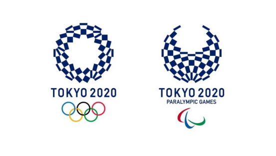
The logo of the 2020 Tokyo Olympics is a fusion of minimalism and futurism. It combines the “circle” element in Japanese traditional culture with modern geometric forms, showing Japan’s precision and innovative spirit. This design style coincides with Tokyo’s own modern image and also symbolizes Japan’s infinite vision for the future.
Design Analysis:
Minimalist futuristic feel: The simple geometric shapes of the logo showcase the sophistication and simplicity of Japanese culture, while also emphasizing a futuristic feel.
Profound cultural meaning: The circular design symbolizes “harmony” and “unity”, which are the core of the Olympic spirit.
Looking at this design, we can’t help but wonder: Can the minimalist design style convey the complex and profound cultural connotations of the Olympics? Or is this minimalism just the most perfect expression of the Olympic spirit – simple, pure and powerful?
Summary: The design and cultural heritage of the Olympic logo
Looking back at the evolution of these Olympic logos, we can see that from simple to complex, from traditional to modern, from political to cultural, the logos of each Olympic Games have expressed unique ideas and spirits in different historical backgrounds. Behind each design, there are profound cultural symbols and emotional fluctuations.
These logos are not just visual symbols, they are carriers of the times, culture and spirit. Behind the seemingly simple graphics, we can feel the power of global solidarity, cultural exchange and the common pursuit of excellence by mankind. These logos not only represent the success of each Olympic Games, but also witness the struggle of athletes around the world and the inheritance of the Olympic spirit.
Editorial note: This is independent cultural and historical commentary. It is not official, authorized, sponsored, endorsed by, or affiliated with the International Olympic Committee, Olympic Games organizers, teams, venues, museums, athletes, or rights holders mentioned.

Related Posts