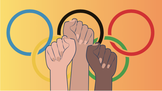
The Olympic logo, as a symbol of global events, almost without exception, will arouse strong reactions from the public. Every time a new logo is launched, it is accompanied by heated discussions and different evaluations – this is not only an evaluation of the design itself, but also a profound reflection of the Olympic spirit, cultural background and characteristics of the times. But what exactly makes the Olympic logo so eye-catching? How did it evolve from a simple design to a symbol of global sports and culture? Let’s review and think about the controversy and love.
Controversial Voices: A Contest on “Beauty”
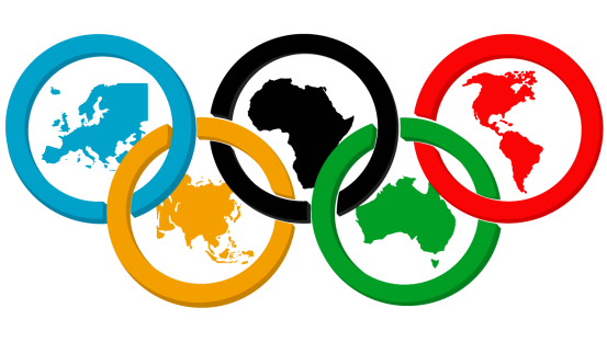
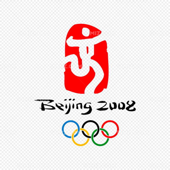
Whenever a new Olympic logo is born, it always brings a lot of controversy. Is it just a design problem? No, the deeper reason behind it is the collision of culture, history and emotion. Just like the logo of the 2008 Beijing Olympics – “Lucky Clouds”, although it incorporates elements of traditional Chinese culture in its design, it has also caused a lot of doubts and controversy from the outside world. Some people think it is too complicated and lacks modernity; some people think it is not representative enough and cannot perfectly express the globalization and inclusiveness of the Olympics.
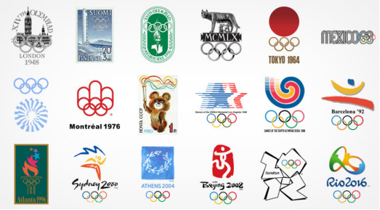
So, is it really impossible to reconcile the collision between tradition and modernity? Not necessarily. In fact, it is this “tug of war” between cultures that makes each version of the Olympic logo carry strong emotional fluctuations. From the simple design of the 1956 Melbourne Olympics to the geometric and dynamic graphics of the 2016 Rio Olympics, every design change seems to be responding to the cultural needs and aesthetic trends in different eras.
The power of love: the cultural resonance behind design
However, not everyone is dissatisfied with these controversies. Many people love and admire the design of the Olympic logo. Especially the logo of the 1980 Moscow Olympics, which successfully combined the cultural symbols of Russia with the global significance of the Olympics. It is simple but symbolic, and conveys an emotional resonance of “strength and peace”. When we see the simple red stripe symbol intertwined with the five rings, can we not help but sigh: how can these seemingly simple lines condense such a profound history and culture?
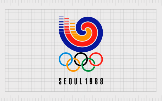
By the time of the 2000 Sydney Olympics, the logo design was undoubtedly popular. It used vibrant colors and shapes, giving people a positive and uplifting feeling. Especially for Australia’s local culture, it is not only an expression of the Olympic spirit, but also a symbol of Australia’s multiculturalism and hospitality. It is not only a display of globalization, but also touches the cultural roots of every audience, bringing a silent sense of power – is this the charm of design?
Why is the logo so important? What emotions are behind it?
So why are we so obsessed with the design of the Olympic logo? What does it represent? Yes, the Olympic logo is not just a visual symbol, it carries people’s understanding of the Olympic spirit and their emotions. Every design change seems to be trying to express a certain collective consciousness, cultural identity or global cohesion in the context of the times.
For example, the logo of the 2008 Beijing Olympic Games symbolizes China’s move towards the world, promoting traditional Chinese culture while also conveying the inclusive and harmonious Olympic spirit. With the advancement of globalization, the logo of the 2016 Rio Olympic Games emphasizes interaction and modernization. Its dynamic and modern sense reflects the changes of the times, and also represents the desire of more and more countries to express their unique culture in global sports events.
Have you ever wondered why some logos can cause such a strong response around the world, while others are diluted or even forgotten? The difference between them lies not only in the quality of the design, but also in the depth of the emotions and culture conveyed behind the design.
The global vision behind the design: Why every detail matters?
The Olympic Games is one of the most important sporting events in the world, so the design of its logo must convey the Olympic spirit while also meeting the aesthetic and emotional recognition of a global audience. This is no easy task. In some cases, designers need to find a balance between innovation and tradition, being faithful to the history and culture of the Olympics while making the logo sufficiently contemporary and visually impactful. Can we ignore the importance of these details?
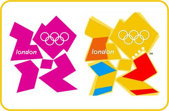
Just like the logo of the 2012 London Olympics, it has almost become one of the most controversial logos in the history of design. Its complex geometric shapes, bold colors and sharp edges have puzzled many viewers. However, it is this “unconventional” design that has made the London Olympics logo well-known around the world. This logo eventually triggered a great discussion on “the boundary between art and design” and “how to break tradition”. Its success does not lie in the fact that everyone likes it, but in the fact that it can trigger the collision and discussion of different cultures and aesthetics.
Summary: The multi-dimensional response of the Olympic logo
The design of the Olympic logo is not only an expression of aesthetics, it carries emotions, history, culture and even political significance. Every new design brings different public reactions – some like and praise; some are controversial and questioned; but no matter what, it always inspires attention and discussion around the world. What is reflected behind this is an important value pursued by the Olympic spirit: tolerance, respect and cultural diversity.
The Olympic logo is a symbol of global unity and peace. What kind of design can gain wider recognition? This may be a question we must answer every time we discuss and think about the logo. But no matter what, the emotion and spirit behind the Olympic logo are always the core of our concern.
Editorial note: This is independent cultural and historical commentary. It is not official, authorized, sponsored, endorsed by, or affiliated with the International Olympic Committee, Olympic Games organizers, teams, venues, museums, athletes, or rights holders mentioned.

Related Posts